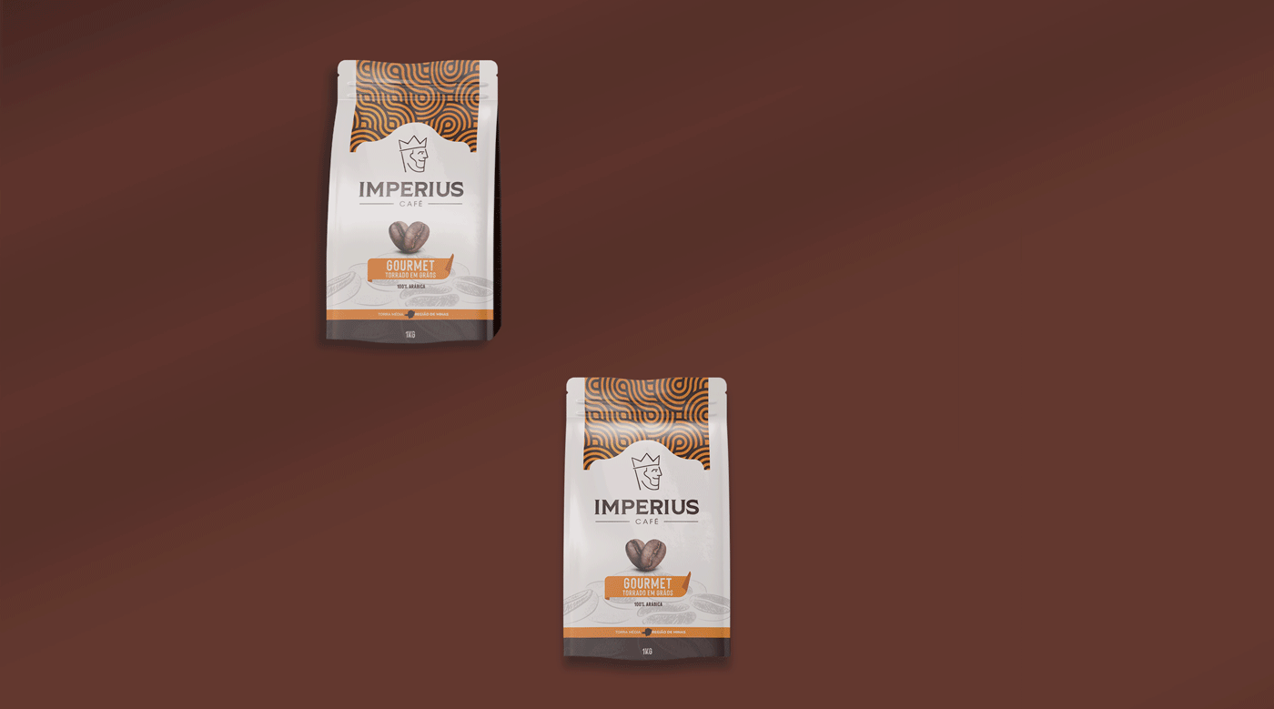
A Landini apresenta as novas embalagens do Café Imperius. As novas embalagens, feitas para o Café Especial Clássico, Café Especial Sul de Minas e o Café Gourmet, fazem parte de um projeto que inclui o desenvolvimento do logotipo.
Landini presents the new packaging for Café Imperius. The new packaging, made for Special Classic Coffee, Special Coffee Sul de Minas and Gourmet coffee, is part of a project that includes the development of the logo.
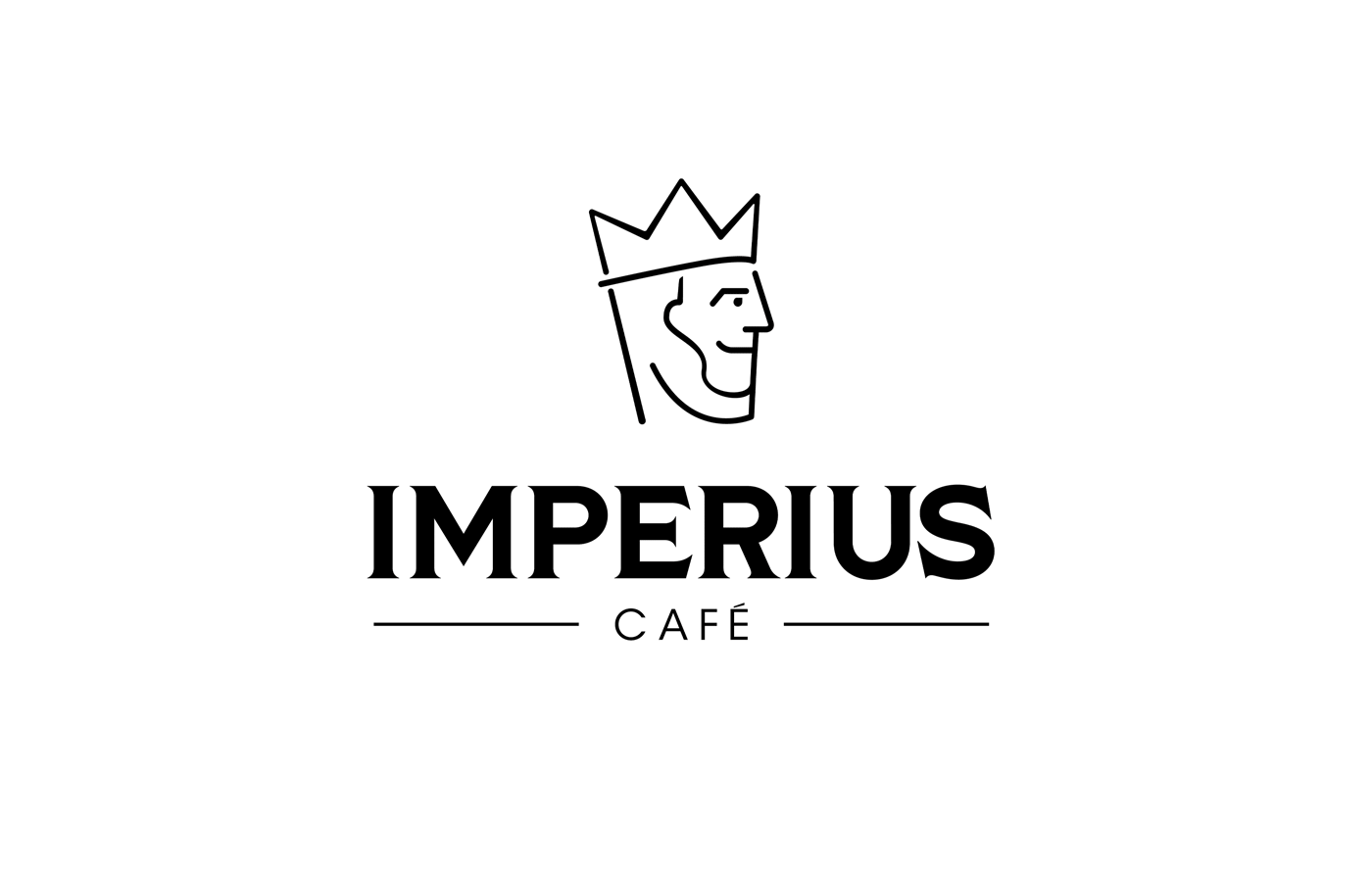

Criamos para a Imperius um logotipo que conecta as pessoas e, mantendo o afeto e paixão pelo café, rejuvenesce a marca. Para isso, trouxemos o símbolo de um jovem rei, no qual os traços trazem aberturas e espaços vazios, que trazem contemporaneidade e modernidade. E no nome principal escolhemos uma base tipográfica inspirada na história dos grandes reis e imperadores, sem perder o charme e o espírito de aventura, uma atitude típica de jovens reis.
We created a logo for Imperius that connects people and, maintaining the affection and passion for coffee, that rejuvenates the brand. For this, we brought the symbol of a young king, in which the lines bring openings and empty spaces, which bring contemporaneity and modernity. The main name we chose was a typographic base inspired by the history of great kings and emperors, without losing the charm and spirit of adventure, a typical attitude of young kings.


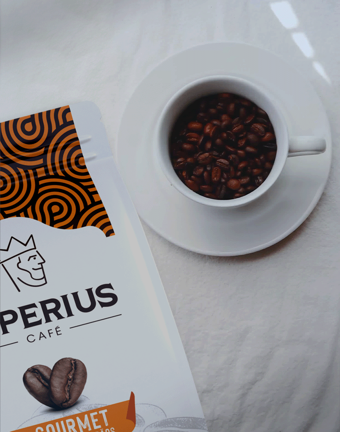
GOURMET EM GRÃOS: Com a combinação do marrom com o laranja, que transmite alegria e confiança, somado a um padrão artístico inspirador, buscamos criar uma conexão com os amantes de café, em especial com os que gostam de novas experiências
CAFÉ SUL DE MINAS: Neste buscamos deixar a área de visualização mais limpa, focando no logotipo, e trouxemos a ilustração dos grãos de café como plano de fundo, trazendo conforto para a comunicação. Para identificar essa categoria, optamos pela paleta de cores composta por marrom e amarelo.
CAFÉ CLÁSSICO: Para o Clássico, buscamos o clássico. Mantivemos a ilustração de fundo com o intuito de unidade para a linha, mas priorizamos a estética limpa com uma única paleta de cor, o marrom, em homenagem aos amantes de café.
GOURMET IN BEANS: With the combination of brown and orange, which conveys joy and confidence, added to an inspiring artistic pattern, we seek to create a connection with coffee lovers, and especially those who enjoy new experiences.
COFFEE SUL DE MINAS: In this case we sought to make the viewing area cleaner, focusing on the logo, and brought the illustration of the coffee beans as the background, bringing comfort to communication. To identify this category, we chose the color palette made up of brown and yellow.
CLASSIC COFFEE: For the Classic Coffee, we seek for the classic. We kept the background illustration with the aim of unity for the line, but prioritizing the clean aesthetic with a single color palette, (brown) in homage to coffee lovers.